The color wheel for coloring: complementary, analogous and triadic colors
The color wheel is the fastest way to pick colors that look good together. Click any color below: the wheel shows which colors go with it, and the little page on the right is recolored instantly.
Opposites on the wheel. Maximum contrast: use one as the main color and the other as a small accent so they make each other glow.
Click any color of the wheel to change the base color. The white dots show the colors that go with it.
What is a color wheel?
A color wheel arranges colors in a circle so you can see how they relate. The artist’s wheel used for pencils, markers and paint has 12 colors: three primary colors (red, yellow, blue), three secondary colors made by mixing two primaries (orange, green, violet) and six tertiary colors in between, like red-orange or blue-green.
Complementary colors
Complementary colors sit directly opposite each other: red and green, blue and orange, yellow and violet. Side by side they create the strongest contrast possible, which makes both look brighter. On a coloring page, use one as the main color and the other as a small accent: a blue night sky with orange lantern light, green leaves with a few red berries.
Analogous colors
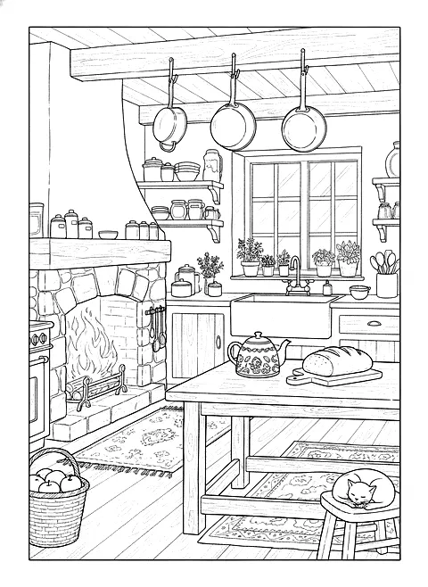
Analogous colors are three neighbors on the wheel, such as yellow, yellow-orange and orange, or blue, blue-green and green. Because they share pigments, they blend smoothly and feel calm and natural. They are the easiest palette for beginners and the best choice for cozy rooms, landscapes, skies and gradients.
Triadic and split complementary colors
A triadic palette uses three colors evenly spaced around the wheel (red, yellow, blue, or orange, green, violet). It is lively and balanced, as long as one color dominates. A split complementary palette takes a color and the two neighbors of its opposite: blue with yellow-orange and red-orange. You get contrast without the tension of true opposites.
Warm and cool colors
The wheel also splits in two halves. Reds, oranges and yellows are warm: they feel close and energetic. Greens, blues and violets are cool: they recede and calm things down. Put warm colors where you want the eye to go, cool colors in backgrounds and shadows.
Practice pages
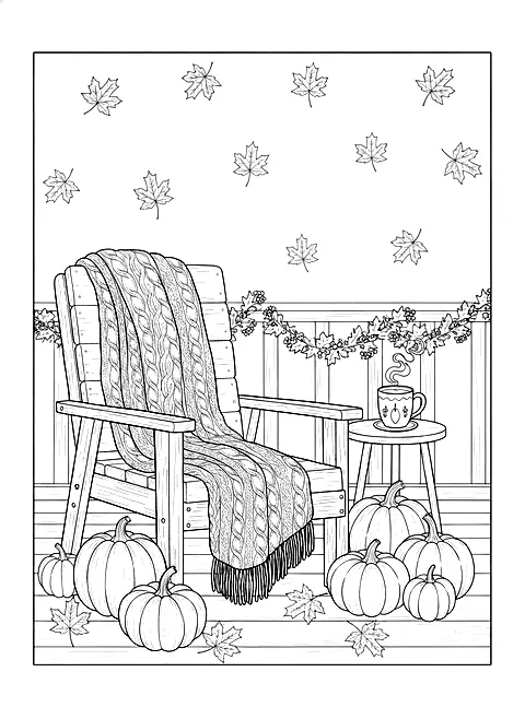
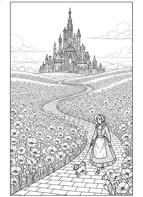
Try an analogous palette on a landscape, a complementary one on a Halloween page, and a triadic one on a bold and easy page.
Step by step
- 1Choose a base color. Pick the color that will cover the largest area of your page.
- 2Choose a harmony. Complementary for contrast, analogous for calm, triadic for a lively page.
- 3Assign the roles. Main color for big areas, second color for medium areas, accent for small details.
- 4Keep some white. Leave highlights uncolored so the page breathes.
Questions
What are complementary colors?
Colors opposite each other on the color wheel, like blue and orange or red and green. They create maximum contrast.
What are analogous colors?
Three colors next to each other on the color wheel, like blue, blue-green and green. They blend smoothly and feel calm.
How many colors should I use on one coloring page?
Three to five is plenty: a main color, one or two supporting colors and an accent.
What is the difference between the RYB and RGB color wheels?
RYB (red, yellow, blue) describes how pigments like pencils and paints mix; RGB describes light on screens. For coloring, use RYB.